How Can We Help?
KentUU Style and Branding Guide
A brand identity creates a consistent visual identity in the community. The Unitarian Universalist Church of Kent constructed Hobbs Hall “Not for Us Alone.” We then commissioned Saul Flanner to create logos that reflected our historic roots, our connection to the land, and a unified look for our growing campus. This guide is maintained and updated by the Connections Coordinator.
The full, accessible, guide is available at KentUU Style and Branding Guide (PDF)
Naming Conventions
“Unitarian Universalist Church of Kent” is a very long name. In recent years, we have abbreviated it to UUCK. However, our website–our main vehicle for both internal and external communications–is www.kentuu.org. Using the abbreviation KentUU will remind people of the URL.
In communications to organizations or entities outside of our church or denomination, it’s important to use the full name the first time, with the abbreviated name in parentheses behind it, e.g. Unitarian Universalist Church of Kent (KentUU), or Unitarian Universalist (UU) Church of Kent, before using the abbreviation in the rest of the communication.
Voice
The tone of our communications should signal that we are a covenantal community centered in Love. Articles, web page copy, instructions (including signage) should be relational, kind, helpful, and respectful of differences. Avoid language that is passive-aggressive, preachy, or scolding.
Branded Templates
Core Visual Elements
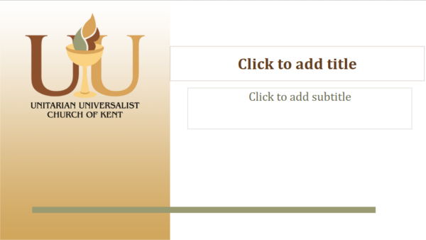
Our dominant identity is that of a religious community, the Unitarian Universalist Church of Kent. The unifying elements of the logo are a stylized chalice, and the letters UU. The chalice can be used alone, with the UU letters, and with additional text: